Elop is on an exciting journey towards the launch of our unique rolling ultrasound scanner and cloud-based application in December. As a part of that journey we are making some changes to the way we present our company ensuring that our brand communicate what is important for us as technology provider and that it reflects what we actually do.
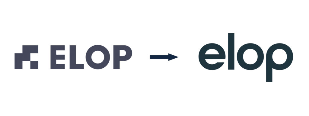
So, today we’re launching a new logo! We loved our old one, but as Elop evolves, so must our branding. Our original logo had a tough industrial look, very much like the concrete we are trying to maintain. Today, Elop is a green-tech company, developing advanced tools, applications and software to provide asset owners with smart solutions that improve safety, extend asset lifetime, and minimise total lifecycle cost and environmental footprint. This require a logo and brand with a more modern and softer look.

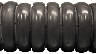
The soft and round shapes of this logo give a warmer and more modern feel, and the circles in the O and the P symbolise the unique wheels of our ultrasound scanner.
Over the next few weeks, you will see not only our logo evolves, but also other visual elements aligning to this new direction such as the website.
Watch this space for new reveals!


